A Faster, More Intuitive Way to Manage Flights
As the lead designer on Stellar’s Scheduling product, I worked to replace outdated tools with a user-focused experience that matched the speed and complexity of real-world flight operations.
Challenges
Redesigning scheduling software for charter flight operations meant working within a high-stakes, highly regulated environment—while building trust with users accustomed to legacy tools.
Regulatory Pressure: Operators needed to move quickly while ensuring that every trip complied with industry regulations and documentation standards.
Cost of Change: The industry had relied on legacy systems for over two decades. Even with clear pain points, users were hesitant to switch due to training overhead and fear of losing essential functionality.
Deep Customization Expectations: Legacy platforms offered extensive configuration options. Matching that flexibility—without overwhelming users—was essential to adoption.
Designing Practical Solutions
Workflow-Driven, User-Validated Design: Mapped and refined complex scheduling workflows to reduce friction, simplify task flows, and support operational accuracy of our customers. Through a structured beta testing program, I gathered direct feedback and observed usage patterns—ensuring the MVP aligned with user expectations.
Result: Design changes led to faster task completion, reduced reliance on manual workarounds, and significantly improved adoption—achieving 60% usage among beta testers and cutting training time from 2+ months to just 1–2 weeks for smaller operators.
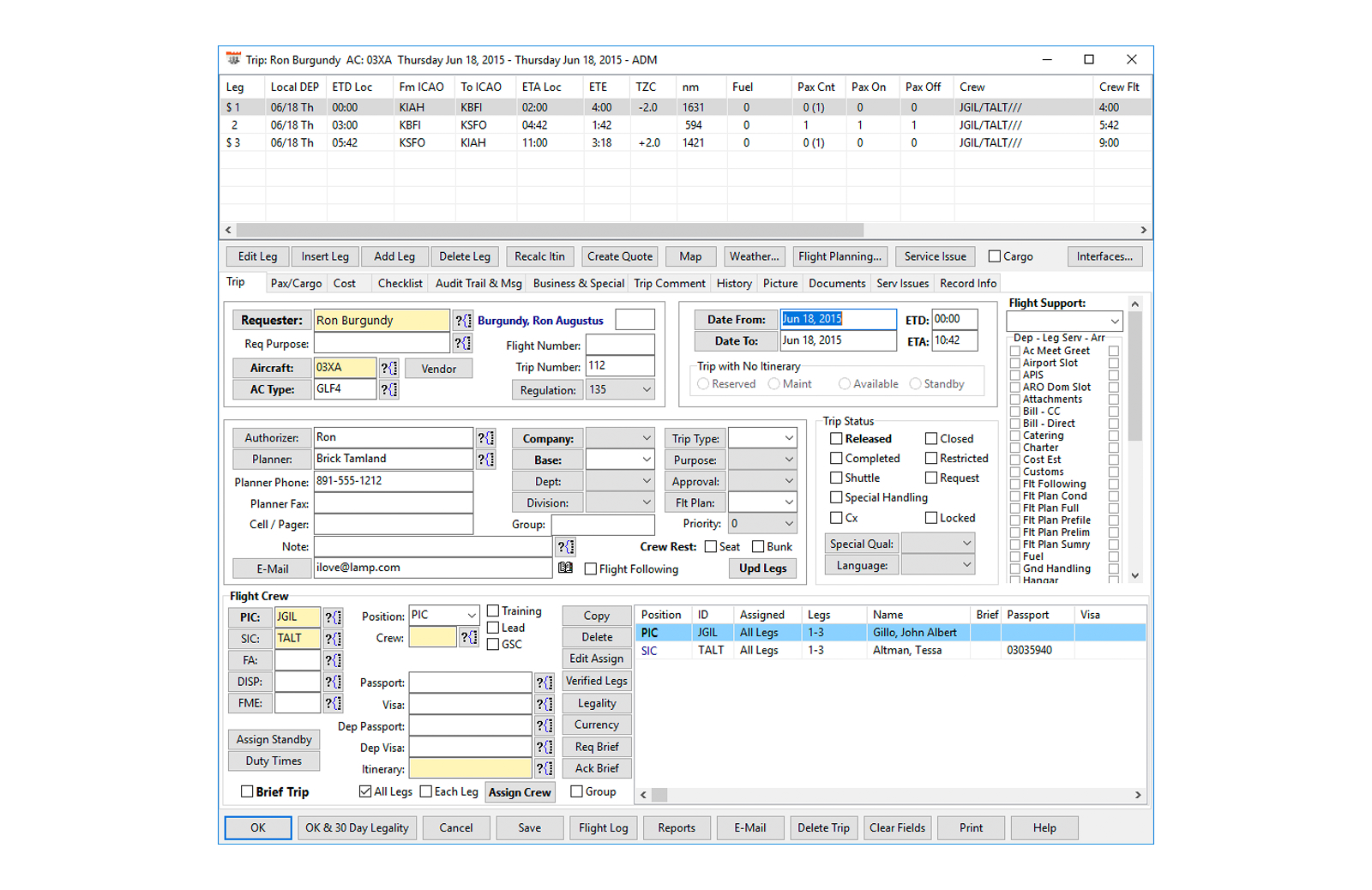
Before
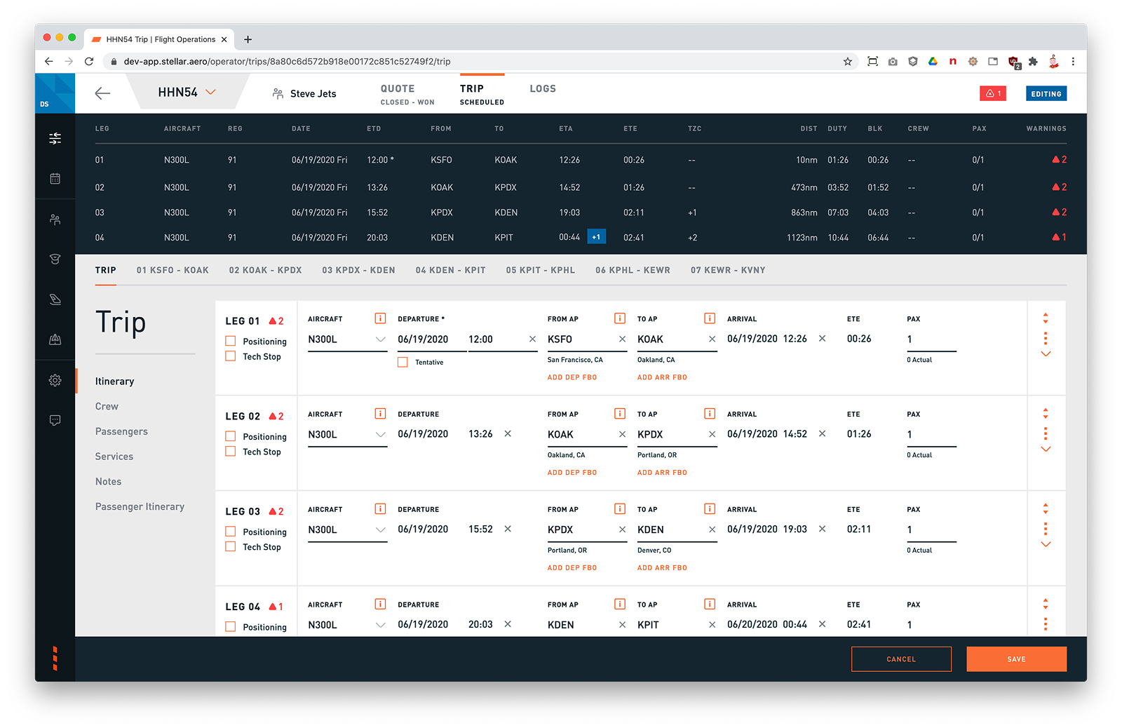
After
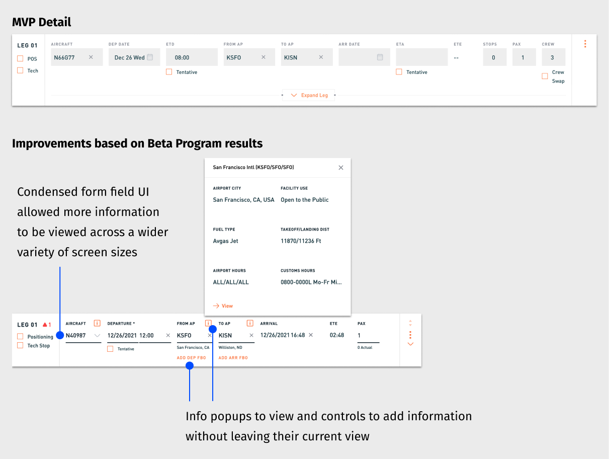
Increased Information Visibility: Redesigned layouts to keep more relevant trip data on screen—including popup tools, condensed form fields, and responsive layout patterns.
Result: Operators accessed more information at a glance and took action with fewer interruptions or context switches.
Cross-Suite Collaboration: Coordinated with designers across the entire Stellar platform—spanning Customer Portal, Quoting, Scheduling, Invoicing, and BI—to ensure consistent UX patterns and interconnected workflows.
Result: Design decisions in Scheduling supported and scaled across the full charter operations lifecycle.

Design System & Cross-Team Leadership
While contributing as an individual designer, I partnered closely with the head of design to scale our team’s influence across the product, development, and support orgs.
- Design System: Co-led the creation and evolution of a shared component library to ensure visual consistency, speed up iteration, and reduce duplication across the platform.
- Cross-Functional Collaboration: Helped integrate designers into early estimation and planning sessions—ensuring our intent was carried through to implementation and surfacing UI issues earlier through direct involvement in QA.
- Customer Insight Access: (continuous discovery) Worked with PMs and Support to get designers closer to customer feedback—including joining live calls—and created a shared repository for storing insights across the team. This living archive became a critical tool for spotting patterns and informing product improvements, even when we couldn’t run formal research at the start of a project.
- Teamwide Design Critique: Initiated regular critique sessions that created space for feedback, shared UI/UX patterns across products, and improved cohesion across independently owned product areas.
Project Impact
By driving end-to-end design from discovery through delivery, I helped create a product that operators not only adopted but trusted to run critical parts of their business. Improvements to Scheduling also enhanced the customer experience by improving search quality and increasing the value of sales leads—an example of how thoughtful UX can ripple across the entire product ecosystem.