At Spruce Finance, design was not limited to internal tools or customer-facing applications—it also played a key role in shaping how the company presented itself to the market. In addition to my product design work, I collaborated with the marketing team to support a company-wide rebrand and create collateral that helped both customers and sales teams engage with our products more effectively.
Challenges
The company’s evolving product line needed a cohesive brand identity that reflected trust and innovation in clean energy financing.
Marketing materials—such as spec sheets and product guides—needed clearer visual structure to be easily understood by both sales teams and homeowners.
Customer-facing digital experiences required a consistent look and feel aligned with the new brand.
Design Contributions
I contributed across several key marketing initiatives:
Rebrand Campaign → Designed digital and print assets that aligned with the updated brand identity.
Website → Supported updates to the marketing site with visuals and layouts that reflected the refreshed brand.
Customer Portal → Designed features that gave homeowners a clear view into their energy usage and financing status.
Sub-Branding → Developed visual systems for product-specific branding to differentiate offerings within the Spruce portfolio.
Spec Sheets & Product Guides → Designed materials to help sales teams explain products with clarity and professionalism.
Impact
Consistent brand identity across web, print, and digital channels.
Stronger sales enablement through polished, easy-to-use collateral.
Improved customer trust by aligning the customer portal with the company’s rebranded identity.
Guiding sales teams with the right tools at the right time.
Selling solar and energy-efficiency projects requires navigating financing options, qualification rules, and product details—all while building trust with homeowners. To support sales reps in this complex process, I designed resources that extended beyond the core app experience, helping teams adopt SpruceFlow more easily and work with greater confidence.
Challenges
Sales reps often needed additional guidance when learning how to use the platform.
The lack of built-in support and reference materials led to frequent calls to customer service.
Training new reps at scale was time-consuming and inconsistent.
Design Improvements
I focused on designing solutions that balanced self-service learning with in-the-moment support:
User Guides → Clear, step-by-step guides for onboarding and reference, written and designed for quick comprehension.
In-App Guidance → Contextual help and tooltips embedded directly in SpruceFlow, giving reps answers where they needed them most.
Impact
Reduced customer service calls → Reps were able to troubleshoot and complete tasks without external support.
Faster onboarding → New hires learned how to qualify and sell more quickly.
Increased confidence → With both offline and in-app resources, sales reps felt more prepared in customer conversations.
Designing for speed, accuracy, and confidence in financing decisions.
Spruce Finance’s underwriting team played a critical role in reviewing and approving financing applications for solar and energy-efficiency projects. However, the tools they relied on were complex and slowed down both training and day-to-day work. My role as UX/UI Designer was to streamline the underwriting process, making it faster for team members to review applications, apply consistent standards, and communicate approvals.
Challenges
Underwriters needed to evaluate multiple data points across different systems, which created inefficiencies.
New team members faced a steep learning curve, increasing training time and delaying productivity.
Slow responses from underwriting created bottlenecks in the sales pipeline, frustrating both sales reps and homeowners.
Design Improvements
Working closely with the underwriting leadership team, I focused on creating a more intuitive, guided workflow:
Simplified interfaces that grouped related information logically, reducing screen-switching.
Clearer workflows with step-by-step guidance for common tasks, enabling new underwriters to get up to speed faster.
Error reduction through input validation and clearer data presentation, which helped ensure consistent decisions.
Impact
Faster response times: More applications reviewed and approved daily.
Improved training: New underwriters reached proficiency more quickly.
Sales pipeline acceleration: By reducing underwriting delays, sales reps could close deals and move projects forward sooner.
Simplifying complex workflows to help reps close deals faster
The core Spruce platform supported solar and home-improvement sales teams in qualifying homeowners, creating financing proposals, and advancing projects toward approval. As UX/UI Designer, I focused on making this complex process faster and more intuitive, enabling sales reps to spend less time hindered by technology and more time engaging customers.
Challenges
Designing SpruceFlow meant balancing the complexity of solar financing with the need for a clear, sales-friendly experience.
Complex Financing Products: Sales reps had to navigate leases, loans, and compliance requirements—often switching between different tools and documents.
High Learning Curve: New reps struggled to adopt the system quickly, slowing down onboarding and limiting sales capacity.
Slow Sales Cycle: Detailed solar designs required scheduling a site audit, delaying proposals and creating friction in moving projects toward approval.
User Confidence: Without clear guidance, reps risked errors or delays that undermined homeowner trust during the sales process.
Qualification & Selling App
Selling residential solar systems and energy-efficiency upgrades involves navigating multiple financing products, compliance requirements, and approval workflows. I worked with Product and Engineering to simplify these interactions into a clear, step-by-step app experience.
Reduced learning curve: Designed an interface that new sales reps could quickly adopt, shortening onboarding time.
Streamlined flows: Prototyped and tested different approaches to qualifying homeowners, leading to fewer errors and faster application completion.
Quick Solar Design
One of the most impactful features I designed was Quick Solar Design, a tool that allowed sales reps to model a solar panel system for a homeowner’s property on the spot.
Previously, detailed system specs required scheduling a site audit, often taking weeks. With Quick Solar Design, reps could:
Generate a detailed view of system size, energy savings, and installation cost in minutes.
Show homeowners financing options during the same visit.
Submit proposals for underwriting immediately—cutting down financing approval timelines.
This tool not only accelerated the sales cycle but also gave reps more confidence in front of customers, helping them close deals faster.
Project Impact
SpruceFlow transformed how sales reps qualified homeowners and proposed financing. By simplifying workflows and introducing tools like Quick Solar Design, the platform shifted from being a barrier to becoming a sales enabler.
Faster Financing Approvals → Quick Solar Design cut proposal timelines from weeks to same-day.
Increased Adoption → A more intuitive interface reduced onboarding time and encouraged wider rep usage.
Stronger Customer Experience → Sales reps gained confidence in front of homeowners, making the financing conversation smoother and more trustworthy.
Together, these improvements modernized solar financing at Spruce—helping sales teams close deals faster while giving homeowners a clearer path to clean energy.
From Uncertainty to Confidence in the Booking Experience
Some customers were struggling to find and book flights through Stellar’s interface—but the “why” wasn’t clear. With limited resources and time, I led a lightweight user testing program to pinpoint the root causes and validate quick design improvements.
Key Improvements
Prototype Testing in Real Scenarios: Wrote scripts to guide participants through realistic booking scenarios and built a working prototype to test proposed solutions.
Result: Identified key moments of friction, including time-setting controls and unclear navigation labels.
Screenshot of moderated test recording
Clarified Navigation and Booking Controls: Improved labels, added guidance icons, and designed toggle interactions with animation to increase clarity and responsiveness.
Result: Users better understood options like “arrive by” vs. “depart at” and felt more confident when adjusting settings.
Persistent Context for Confidence: Redesigned the results screen to carry forward key information entered by users, maintaining continuity and reducing decision anxiety.
Result: Increased user confidence and trust in the results they were seeing.
Project Impact
In just a few rounds of testing, we surfaced actionable insights that clarified key booking interactions. The changes made a measurable difference in how users understood and navigated the experience—leading to a more confident and successful booking journey.
As the lead designer on Stellar’s Scheduling product, I worked to replace outdated tools with a user-focused experience that matched the speed and complexity of real-world flight operations.
Challenges
Redesigning scheduling software for charter flight operations meant working within a high-stakes, highly regulated environment—while building trust with users accustomed to legacy tools.
Regulatory Pressure: Operators needed to move quickly while ensuring that every trip complied with industry regulations and documentation standards.
Cost of Change: The industry had relied on legacy systems for over two decades. Even with clear pain points, users were hesitant to switch due to training overhead and fear of losing essential functionality.
Deep Customization Expectations: Legacy platforms offered extensive configuration options. Matching that flexibility—without overwhelming users—was essential to adoption.
Designing Practical Solutions
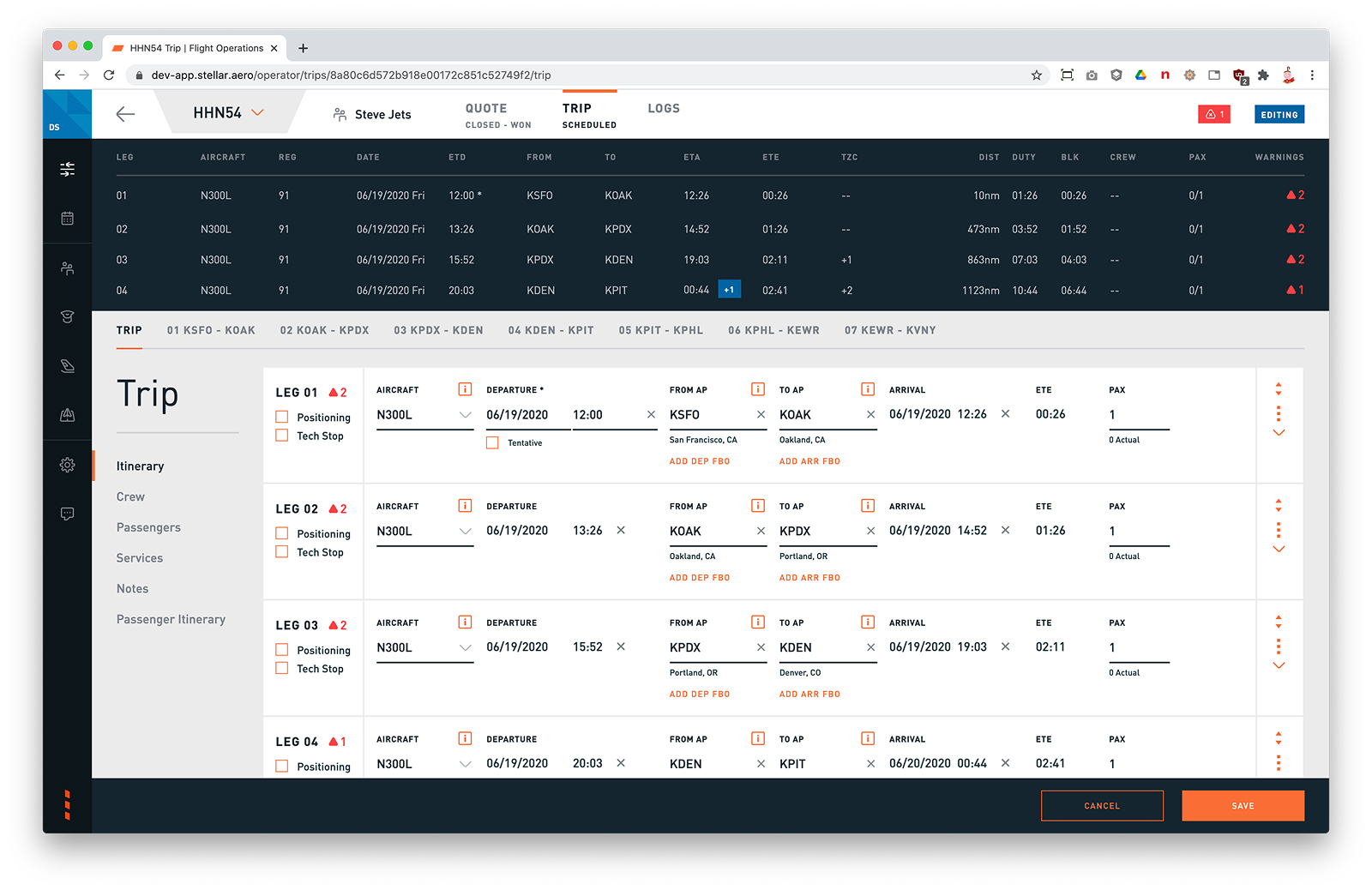
Workflow-Driven, User-Validated Design: Mapped and refined complex scheduling workflows to reduce friction, simplify task flows, and support operational accuracy of our customers. Through a structured beta testing program, I gathered direct feedback and observed usage patterns—ensuring the MVP aligned with user expectations.
Result: Design changes led to faster task completion, reduced reliance on manual workarounds, and significantly improved adoption—achieving 60% usage among beta testers and cutting training time from 2+ months to just 1–2 weeks for smaller operators.
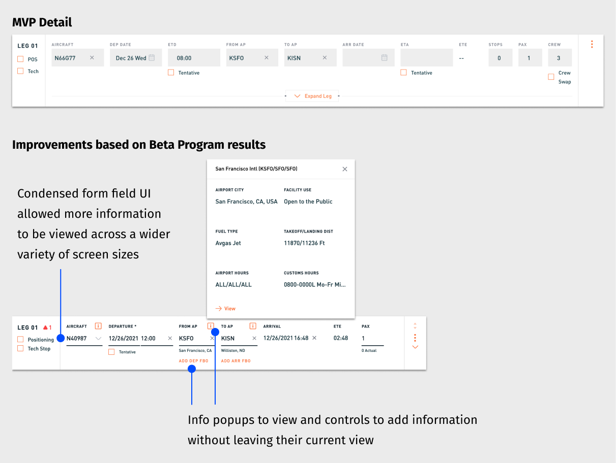
Before
After
Increased Information Visibility: Redesigned layouts to keep more relevant trip data on screen—including popup tools, condensed form fields, and responsive layout patterns.
Result: Operators accessed more information at a glance and took action with fewer interruptions or context switches.
Cross-Suite Collaboration: Coordinated with designers across the entire Stellar platform—spanning Customer Portal, Quoting, Scheduling, Invoicing, and BI—to ensure consistent UX patterns and interconnected workflows.
Result: Design decisions in Scheduling supported and scaled across the full charter operations lifecycle.
Design System & Cross-Team Leadership
While contributing as an individual designer, I partnered closely with the head of design to scale our team’s influence across the product, development, and support orgs.
Design System: Co-led the creation and evolution of a shared component library to ensure visual consistency, speed up iteration, and reduce duplication across the platform.
Cross-Functional Collaboration: Helped integrate designers into early estimation and planning sessions—ensuring our intent was carried through to implementation and surfacing UI issues earlier through direct involvement in QA.
Customer Insight Access: (continuous discovery) Worked with PMs and Support to get designers closer to customer feedback—including joining live calls—and created a shared repository for storing insights across the team. This living archive became a critical tool for spotting patterns and informing product improvements, even when we couldn’t run formal research at the start of a project.
Teamwide Design Critique: Initiated regular critique sessions that created space for feedback, shared UI/UX patterns across products, and improved cohesion across independently owned product areas.
Project Impact
By driving end-to-end design from discovery through delivery, I helped create a product that operators not only adopted but trusted to run critical parts of their business. Improvements to Scheduling also enhanced the customer experience by improving search quality and increasing the value of sales leads—an example of how thoughtful UX can ripple across the entire product ecosystem.
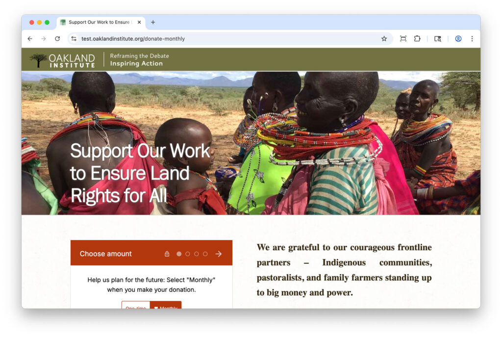
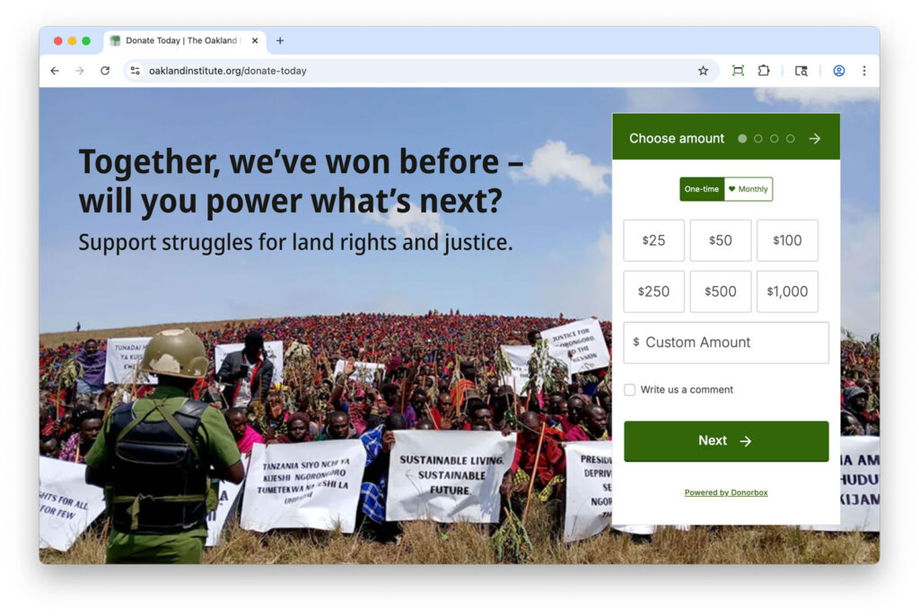
To better advance the organization’s mission and increase donor engagement, I refined the giving experience across the website, email, and social media—making it easier to give and more compelling to act.
Key Improvements
From page design to messaging cadence, every change was made to reduce friction, build trust, and reinforce why each contribution matters.
Redesigned Donation Page: Introduced a more visual, mobile-friendly layout that emphasizes the why behind each donation and builds trust through clear design and impact messaging.
Before
After
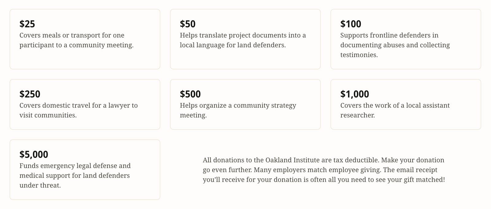
User-Centered Messaging: Rewrote key donation copy to spotlight the tangible outcomes of donor support, showing how contributions help expose injustice and support communities worldwide.
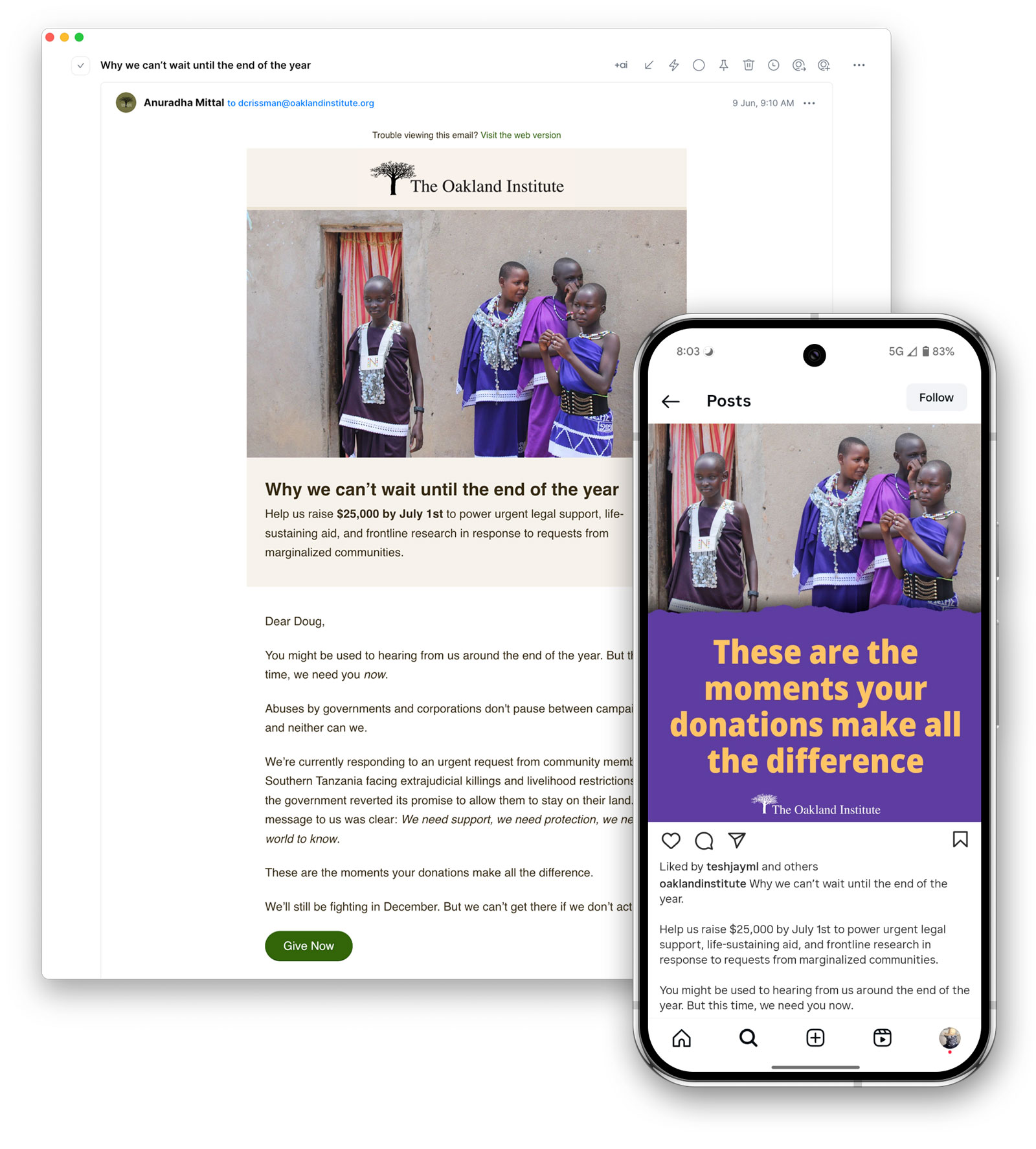
Consistent Communication: Increased the frequency and clarity of calls-to-action across email and social media, creating more touchpoints for engagement without overwhelming supporters.
Results
Twice as Many Donors Took Action
A simplified donation experience and stronger storytelling inspired more people to give.
Modest but Positive Growth in Donations
While the total dollar amount rose slightly, the growth in individual donors lays the groundwork for more sustainable fundraising over time.
Project Impact
The shift wasn’t just in numbers—it was in connection. A more intentional giving experience helped supporters feel confident, informed, and inspired to take action.
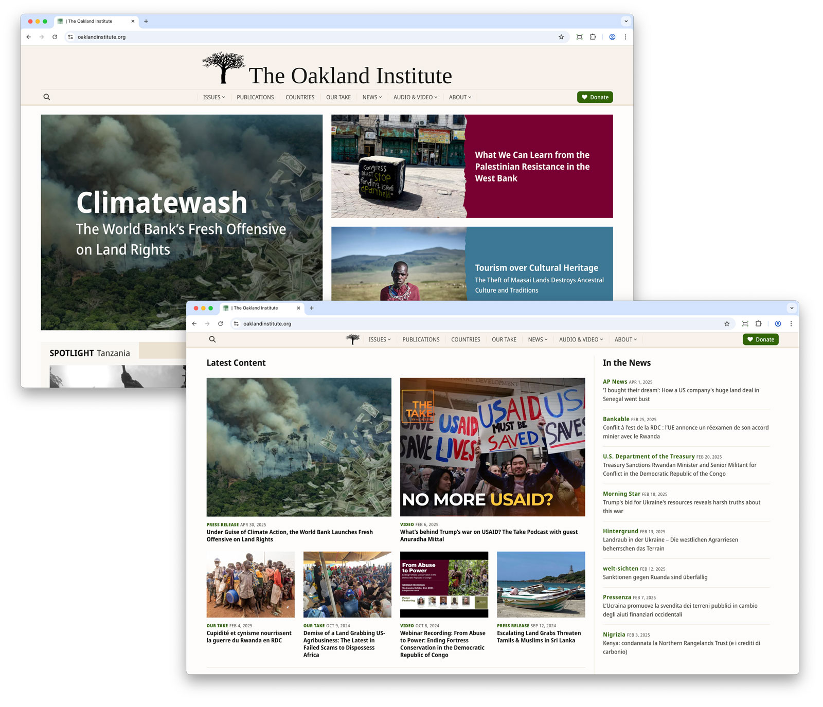
The Oakland Institute website had not seen a major update in over a decade. With outdated technology, a cumbersome structure, and a design that no longer reflected the quality of its research, the site was long overdue for a refresh. I led a full-scale redesign and platform migration to modernize their digital presence—resulting in a faster, more accessible, and user-centered experience.
Key Improvements
The redesign prioritized user needs, content discoverability, and operational efficiency. Below are the most impactful changes and what they achieved:
Content-Led Design: Surfaced a greater variety of stories and publications on the homepage through a more dynamic and content-rich layout—encouraging exploration across a wider range of the Institute’s work.
Result: Increased the number of unique articles clicked from the homepage and boosted the prominence of stories among top clickthroughs.
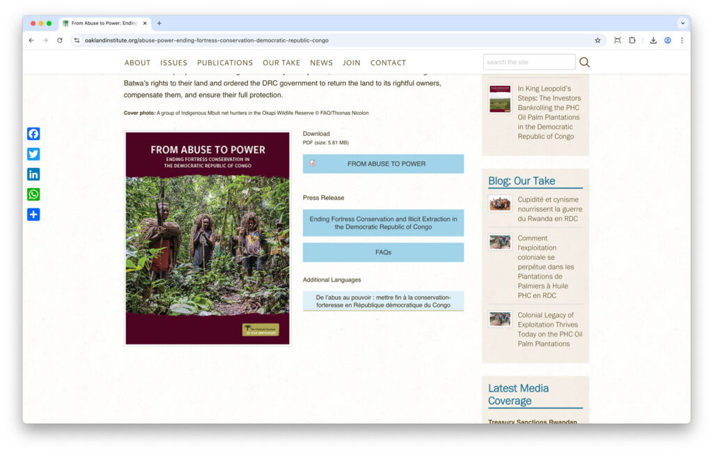
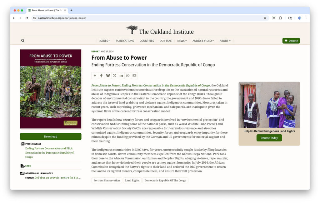
Simplified Navigation: Made it easier to find key reports and related content with clearer hierarchy, structured layouts, and prominent calls to action that guides users to high-impact content.
Result: Users engaged more deeply with priority content—more downloads and higher views per visit.
BEFORE
AFTER
Smarter Reading Experience: Made longform articles easier to navigate with section overviews and improved footnotes—supporting both content engagement and inclusive access.
Result: Users stayed longer and engaged more deeply, with average reading time doubling.
Modern Infrastructure: Migrated the site from Drupal 7 to 11, gaining a modern development foundation, cleaner templating, and dramatically faster publishing workflows—making it easier to maintain, scale, and evolve over time.
Result: Reduced publishing time and increased reliability in content updates through an improved development workflow.
Project Impact
A modernized platform that advances the Oakland Institute’s mission by making its research more discoverable, its message more compelling, and its engagement with key audiences more effective.
But improving how people access the Institute’s work was only part of the transformation. Learn how I also enhanced the donation experience to grow support and deepen impact: